Artwork Guidelines
Let’s make your design process easier and more efficient! Our handy artwork guidelines walk you through everything you need to know for a perfect print. From color modes to file formats, we’ve got you covered. And if you ever feel stuck, don’t worry—we offer free design help for all our customers, anytime you need it.
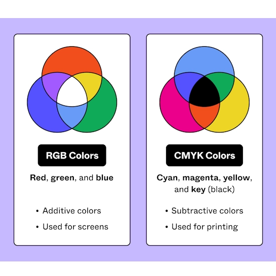
Color Mode
To achieve accurate and consistent color output, design your artwork in CMYK (Cyan, Magenta, Yellow, Black) or Pantone spot colors, depending on your printer’s requirements. Avoid using RGB (Red, Green, Blue), as it’s meant for digital screens and may result in color mismatches when printed. Always convert RGB to CMYK before finalizing your artwork for print.
Fonts and Text
For optimal legibility in print, use fonts no smaller than 9pt. While you can zoom in on digital screens to see small text, printed designs don’t allow this flexibility. Also, be cautious with decorative or cursive fonts—they may appear less sharp in print. Choose clean, readable fonts to ensure clarity on your packaging.
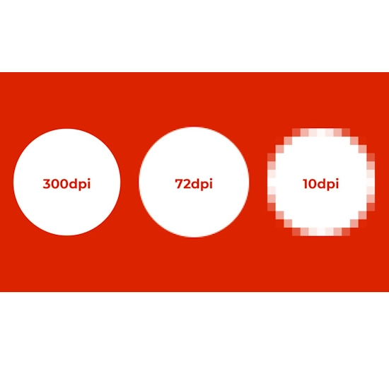
Resolution
Ensure all artwork is created at a minimum of 300 DPI (dots per inch). This resolution is necessary for sharp, high-quality prints. Artwork with lower DPI may appear blurry or pixelated when printed.
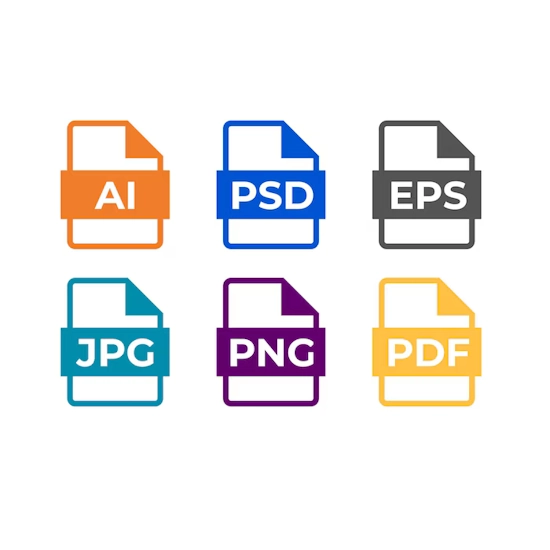
File Formats
Submit your artwork in high-resolution, print-ready formats such as PDF, TIFF, or EPS. These formats maintain design quality and compatibility with professional printing systems. If your artwork includes photos or raster elements, JPEG or PNG files are acceptable—just make sure they are also 300 DPI.
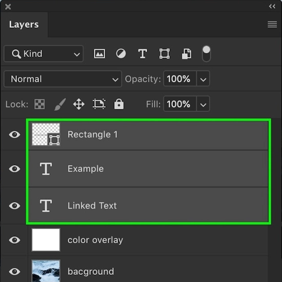
File Organization
Maintain a clean and organized file structure. Use separate layers for different design elements (e.g., text, images, logos), and apply clear naming conventions. Well-organized files minimize confusion and ensure that the correct elements are used in the final print production.
Frequently Asked Questions
Not always. Screen displays (RGB) can show brighter, more vibrant colors than what’s achievable in print (CMYK or Pantone). For accurate color results, use calibrated monitors and request a physical proof or sample when possible.
Low-resolution images (below 300 DPI) may appear pixelated, blurry, or distorted when printed. For professional-quality packaging, always use high-resolution graphics to ensure sharp and clear results.
Yes, but you should ensure:
The font is legible at small sizes (9pt or above).
You’ve converted the text to outlines or included the font file.
Avoid intricate or overly decorative fonts that may not print clearly.
Yes. Including bleed ensures your design prints to the edge without white borders. Trim lines show where the final cut will be made. This prevents unintentional cropping of important elements.
To streamline production and avoid errors:
Keep design elements on separate layers (e.g., dielines, artwork, text).
Use clear layer and file names.
Include a mockup or sample view to help the printer understand your intended layout.
A dieline is a template that shows the exact layout, folds, and cut lines of your packaging. It ensures your design elements are correctly placed and helps the printer accurately produce your box. Submitting artwork without a proper dieline can lead to misaligned graphics or trimmed content.
 Company
 Top products
 Help
Help
 Payment Method
